Friday 29 July 2016

CAS Tag, Vase and Flower, Butterfly

Have you been playing along with the current challenge at 'Tag You're It'?
 There's less than a week to go but that's still plenty of time to get those creative juices flowing! 

For those of you who may not have had a chance to stop by at Tag You're It lately...  You may not know that we now have a 'Featured Artist' for each new challenge, bringing us their own design to work with and giving us and you even more inspiration to play along with.  
Yay!!!
So if you have the time, why not give it a go?


My tag for this challenge is probably the most CAS thing I have ever made...  and boy did I struggle leaving all that white space.
I have to confess I tried many, many ways to incorporate some colour into the background...  but not one of them looked right.  And yes, I did consider Embossing Folders...  but then I would have lost the definition of the 'flight path' stitched detail.   
So in the end I resigned myself to the fact that, in this instance, lots of white space was the way to go...   but to make myself feel better I did spray the whole background with glitter varnish before adding the vase, flower and butterfly.  (And yes, it really did make me feel better)!


Here's my tag...


...  and here's a close up so you can hopefully see the glitter varnish...


I'm always trying to find ways to sneak in a little dimension with my CAS projects.
How did I achieve that on this design?
Well, firstly I chose a die that I could emboss and add colour to. Then I cut a bottom flower head in red and the top overlapping in a deep pink colour.   
Then I chose a stitched detail that adds to the scene without adding any colour whatsoever...  and added a butterfly that's glued only at the centre - so I can raise the wings a little. 
Cutting the vase from vellum and then inking around the edges meant that any glue that would normally show through was now hidden - I just spot glued behind the inked edges only.
Even my glitter varnish base gives added texture - how's that for a happy coincidence?

I will never be a one layer girl and I'm ok with that.  It's simply not in my skill set.
Why worry about what I cannot change?  We can't all be good at everything, after all!


The Featured Artist for this challenge is a lady by the name of Amy Tsuruta.
Here's her tag on a card...


It's easy to see where I got my inspiration from this time, isn't it?!


Supplies Used:

Dies:
Sizzix Thinlits 'Flower Vases'
Marianne Designs (Creatables) 'Tiny's Tulip'
Memory Box 'Peaceful Butterfly Wings'
Memory Box/Open Studio 'Busy As A Bee'

Ink:
Tim Holtz Distress 'Walnut Stain'
Tim Holtz Distress 'Forest Moss'
ColorBox Pigment Ink 'Frost White'

Other:
Crafter's Companion 'Spray and Sparkle'  (Pearl Diamond)
Vellum
Ribbon


Challenges I'm Entering...

Simon Says/Wednesday 
Anything Goes


(Made entirely from Snippets)


Challenge #262   'A Stitch In Time'


Week #373   'Anything But A Card'


Tic-Tac-Toe Challenge #14
(Add Dimensional, Intricate Dies, Ribbon)


Challenge #153   'Gift tags'


Cardz 4 Galz
Challenge #27   'No Patterned Paper'


Wishing you the happiest of weekends...

Donna. x


Wednesday 20 July 2016

Stick Frames, Postcard, Vellum,

  If you read my last post you will know that my friend Olga kindly sent me some lovely goodies a few weeks ago - including some Stick Frames die cuts (Poppystamps).
Today's card uses the last of these...  which is good as I didn't want them to go to waste, but bad as although I have this die on its way to me from America, it's still not here yet!
No one in the UK seems to have this die in stock...  Well, no one I can find, anyway!
The truth is, most online shops over here are still waiting on deliveries of the latest additions to the range - and then it's a case of waiting to see which dies they choose to stock. 
And I'm not very good at waiting!!!
Oh well...


Today's card has been made with the CAS Mix Up Challenge in mind...


I always find CAS a real challenge, so to be allowed to blur the lines a little is fantastic news.  It means I can sneak in a layer, add some texture paste, distress some edges a little, add some ink...  and many more things besides.  As long as it's still CAS by nature, it fits this challenge theme.
Have you tried playing along?


  Here's my quick 'how to'...

Stamp Postcard image on to a piece of card stock.  Trim to size, distress and ink up edges.
Tear a piece of vellum to size.  Put to one side.
Using Embossing Ink, apply stamp image to a second piece of vellum.  Emboss and tear to size.
Wrap both vellum panels around postcard and attach from the back.
Cut out/Punch other Die Cut shapes - Spiral Flower, Leaves and Butterflies.
Add Marker details to Leaves.
Ink up edges of Spiral Flower (front and back), then roll up and glue into shape.
Glue all Die Cuts into place.


Supplies Used:

Stamps:
Penny Black 'Postcard'
Hero Arts Cling 'Two Vine Scrolls'

Dies:
Poppystamps 'Sticks Frame'
Memory Box 'Peaceful Butterfly Wings'
Sizzix/Holtz 'Tiny Tattered Florals'

Ink:
Holtz Distress 'Walnut Stain'
Ranger 'Perfect Medium'

Embossing Powder:
Stampendous 'Clear Detail'

Marker Pen:
Tsukineko (Memento) Dual Tip 'Olive Grove'

Punch:
Martha Stewart 'Pop Up Butterflies'

Other:
Vellum
Scrap of Glitter Card
Holtz Distress Tool


Challenges I'm Entering...

CAS Mix Up Challenge
(I chose Stamping, Markers, Heat Embossing, Die Cuts and a Punch)


That's Crafty
Feminine Challenge


Pixie's Crafty Snippets Challenge
(Vellum and all die cuts/punched shape from my snippets stash)


I am so glad Summer has finally arrived here in the UK.  It never lasts for very long so I plan to enjoy it.  You won't catch me complaining it's too hot!!!

Wishing you a fantastic rest of your day...

Donna. x

Wednesday 13 July 2016

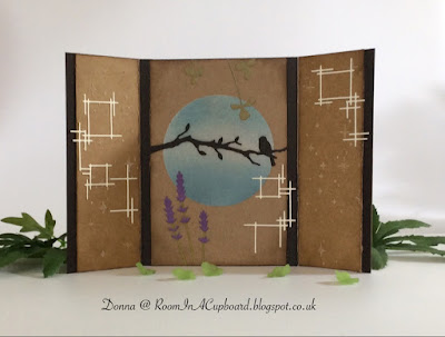
Gatefold, Quiet Bird Sash, Kraft Card

I have a confession to make.  
It's not a big confession, but it will hopefully clear up a misconception that I know quite a few of you are under.  
You see, as well as disliking bright, bold colours I also dislike the colour black.  It's just way too stark for me.  So I use it very minimally and very, very occasionally.  Kind of only when I absolutely have to...

Now I know that quite a few of you are going to be confused now - which is kind of my own fault really as
A)  It never even occurred to me until reading through some of your comments
and
B)  I didn't have the heart to tell you.  Especially when you'd been so kind to stop by...

However...

What you see on your monitor as 'black' when looking at my 'makes' is more often than not a colour called Deep Cocoa.  It's a very, very dark brown that is my absolute favourite - which you can probably tell as I use it quite a lot!

So now you know...

But before I go on to show you my 'make' for today, let me just say that just because I don't like to use big, bold, bright colours doesn't mean that a lot of you aren't fantastic at making craft projects from these colours that I do enjoy and appreciate seeing.

I'm kind of weird like that!


My card for today has been made specifically for the latest Poppystamps Challenge...


...  and as it's a Gatefold Card you get to see more than one photo...


I thoroughly enjoyed making this card, and truth be told, it's so 'me' that I'm going to struggle to part with it!
(Now I know how sad that sounds...  but I also know that I'm not the only one).


Here's a quick run down of how this card was made:

Using a Circular Mask and a Bristle Brush, apply White Pigment Ink to Kraft Card.
Once dry, use another Bristle Brush to apply two shades of Blue Ink - one light and one dark. 
Leave to one side to dry.
Cut out Die Cuts and assemble where necessary, but DO NOT add to project as yet.
Using a piece of card slightly wider than the Kraft Card, cut out the 'Quiet Bird Sash' Die. 
Make two side panels to form the Gatefolds and attach from the back.
Make two thinner panels from Kraft Card and apply Sparkle Medium through Stencil.
Leave to dry...
Measure up and make another panel with the same dimensions as the Bird Sash Panel. 
(This will become your back panel).
Cut out a 'Distressed Rectangle' Die Cut and ink around edges with Brown Ink.
Attach to back panel and add three Die Cut Flowers.
Distress edges of all Kraft Card panels using a Distress Tool.
Slide largest Kraft Card panel carefully under Quiet Bird Sash panel and glue into place.
Add thinner Kraft Card panels and glue into place.
Apply Die Cuts and glue into place.
Ink Gatefold edges of card with Brown Ink.
Cut a thin strip of card just long enough to wrap around the Gatefold card.
Glue strip and leave to one side to dry.
Cut out a Die Cut Flower, and add Stickles Glitter Glue to the centre.
Once dry, attach Flower to thin strip of card.
Spray thin strip with Glitter Spray and leave to dry.


Now I'm sure many of you will have spotted that I could just as easily have used one large piece of card, cut out the Bird Sash from that and then added everything else accordingly.  
That is the other option IF you want to OR have a machine big enough to do that on.  
It's a matter of personal preference, I guess...  and what size machine you have to use.


Supplies Used:

Dies:
Poppystamps 'Quiet Bird Sash'
Poppystamps 'Stick Frames'
Memory Box 'Long Stem Lavender'
Memory Box 'Meadow Clover'
Poppystamps 'Fresh Petals'
Spellbinders (Nestabilities) Card Creator 'A2 Distressed Edges'

Inks:
ColorBox Pigment Ink 'Frost White'
Tim Holtz Distress 'Stormy Sky'
Tim Holtz Distress 'Broken China'
Tim Holtz Distress 'Walnut Stain'

Stencil:
Memory Box 'Shimmer' 

Other:
Tim Holtz Distress Tool
Crafter's Companion 'Spray and Sparkle'  (Pearl Diamond) 
(Ranger) Stickles Glitter Glue 'Frosted Lace'


Challenges I'm Entering...

(All die cuts from snippets - except Bird sash)


(Flora and/or Fauna)


Feminine Challenge


Create A Scene


Challenge #19   'Anything Goes'


In reality, this card has a lovely soft shimmer on the side panels from the texture paste.  It just doesn't show up on these photo's at all.   
Not to worry...  
You'll just have to use your imagination!

Enjoy the rest of your week...

Donna. x


PS.  Special thanks to Olga for very kindly posting me some goodies - including the Sticks Frame die cuts that I used on my card today.  Mine are yet to arrive and are like gold dust here in the UK!
Thank you, Olga. x

Friday 8 July 2016

Kraft Tag, Large Flower with Script, Ribbon

It's Tag You're It Friday again, everyone!

Please pop on over to the challenge site as there have been a few changes made.  
We think you're going to like them!

*

Our Guest DT for today is a lady by the name of Donna Mikasa.
(I'm guessing some of you have heard of her)!

 When I saw Donna's tag for this challenge I just knew it would be perfect for one of my 'new to me' stamps -
Personal Impressions Flower Words Silhouette.  
Now, this WAS a Stic On Cling Stamp...

Do you think I could find anything online to tell me exactly what Stic On meant?  (You guessed correctly if you said 'no').
So I bought it anyway - as you do...  and when it arrived it was obvious that peeling off the back piece would leave it far too sticky for repositioning.
(I'm guessing you are supposed to permanently mount it to a block).  Oh well...

As I really didn't want to permanently mount it and already had some EzMount in the house it was off to the microwave for me - to warm up the stamp well enough to peel off the backing.  Of course, this stamp took a while to pull apart.  It was VERY well glued together and left a horrible sticky black residue behind.  I ended up using my pokey tool to scratch most of the remainder off!
  Then I traced around the outline of the stamp onto EzMount, cut it out and then sandwiched it all together.
I've not used EzMount that way 'round before and for a tricky shape like this it was actually much easier.

So...  stamp sorted - eventually!  But what about the ink?

I tried lots of inks and lots of colours before settling on VersaMagic Aegean Blue - a beautiful chalk ink that makes the text legible, has a lovely subtle look to it and doesn't leave a splodgy mess behind.  (I found the Brilliance ink pads far too juicy and the Memento's were ok...  but like most other brands a bit 'flat' looking)!

  I guess I should probably show you my tag before I carry on explaining how I put it all together, right..?


As you can see, I've gone for a very basic look with no ink, paint or embossing to the background at all.
I was sorely tempted, but as I really didn't want anything to detract from the central focus (the flower) I held my ground and instead focused on adding depth and texture through the other elements on the tag.

If you look at Donna's tag (the other Donna - not me)..! 


...  you'll immediately see that your eye is drawn in to the centre of that flower.  That's why I used that big button.

So what else has Donna included that I've also included?

Stitched details...
Leaf sprig...
Water colouring...
Three outer embellishments...
A strip running across from left to right...
Script/Wording...
Ribbon... 

My tag may look very different, but all of Donna's elements are there.
My wording's on the flower, the stitching's on the ribbon running left to right, I've water coloured the leaves (instead of the background), added three embellishments and included the tied ribbon, too.

I wonder what she'll make of it?

Oh...  and before I forget, I should probably mention the Memento Rosebud and Brilliance Platinum Planet inks that I added to my ribbons.  Top tip...  leave to dry thoroughly before ironing to set.  Really thoroughly!
Unless you like very inky hands, of course...


Challenge I'm Entering...

Pixies Crafty Snippets Challenge
All of the ribbons are snippets that have been repurposed from packaging.  The leaf and flower are also from snippets of card.


If you have the time to pop on over to the Tag You're It challenge site you'll see that the rest of the Design Team all have their own unique versions of Donna's tag.
We would love to see your version.
Why don't you give it a try?

'Bye for now...

Donna